

Overview
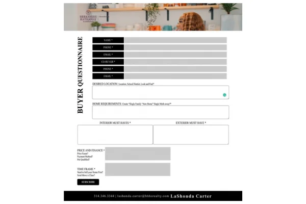
A real estate agent collects new buyer enquiries through a Mailchimp subscription form. The standard Mailchimp form is a plain stack of labels and boxes, so I redesigned it with custom HTML, CSS and clear text. The result is a modern, branded buyer questionnaire that is easy to scan and quick to fill in.
What the form includes:
- A header banner with the brokerage’s branding and a vertical “Buyer Questionnaire” title beside the form
- Contact fields for the buyer and a co-buyer: name, phone and email
- Desired location, covering the area, school district and the look and feel the buyer wants
- Home requirements, with room to describe the type of home
- Interior and exterior “must haves” in two side-by-side boxes
- Price and finance, and time frame, each with short helper questions underneath
- Required fields marked with an asterisk
- A bold black Subscribe button and a footer bar with the agent’s contact details
The Challenge
A buyer questionnaire asks a lot: who is buying, where, what kind of home, what the buyer cannot live without, the budget and the timing. In the default Mailchimp layout, all of that becomes one long, generic list that does not look like the agent’s brand. The task was to make a long form feel short, clear and professional.
Making it easy to scan. I grouped the questions into clear sections, put each label in a strong black block next to its field, and placed the interior and exterior must-haves side by side so the page stays compact.
Matching the brand. I kept to a black and white look with a serif style, a banner image at the top and a black footer bar, so the form feels like part of the agent’s own website.
What I Did
- Started from the Mailchimp subscription form embed code and built on top of it
- Rebuilt the layout with custom HTML and CSS: black label blocks, light input fields, grouped sections and two-column must-have boxes
- Wrote the headings and short helper questions so every field explains what to enter
- Styled the Subscribe button and added the header banner and a footer bar with contact details
- Matched the black and white look of the brokerage’s branding